As I mentioned before my husband and I spent a week in Panama City, Florida and it was an absolutely gorgeous place. The ocean was bluer than I could ever imagine, I think I could get used to that beauty. We stayed at a Marriott property and it was so pretty and comfortable I thought I would show the suite to you and maybe you could use some of these ideas for your own home.
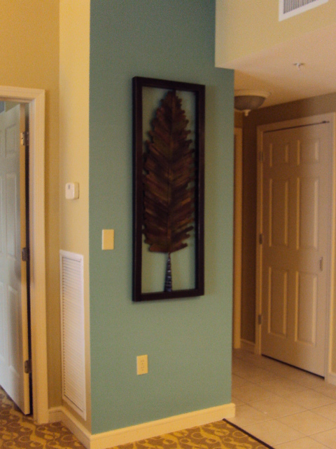
This is the first thing you see when you come it. This blue wall is so pretty. I have the same colors in my home so this place made me feel right at home.
This is the living area, again they repeated that blue wall. Look at the art work, this whole suite has similar art. Easily done yourself by taking photos to the copy center and have them blown up and mounted on a canvas.
Notice the window treatments. They installed the striped sheers over a solid drape. This is so smart we kept the sheer over the window and didn't worry about anyone seeing in and the light could come thru. I was a great way to layer fabrics.
Here is what they look like closed.
This chair is such a smart idea. This is the kind of thing that gives furniture a custom touch and makes your furniture look like a million bucks.
Notice they used 3 different fabrics on this chair. I love the piping detail.
This place had 2 bedrooms. I loved this bed! Check out the headboard, it would be so easy to duplicate. Notice the boxes are painted a contrasting color. This bed makes such a huge statement in the room.
Also notice the bedding. Hotels have finally got it right. I have never been one to want to sleep under a bedspread that someone used the night before me. They have gone to duvet covers, white that can be bleached and to add color to the bed they have these small throws at the bottom. I LOVED this one, it was so soft. I wanted to take it home with me.
Look at this fun curtain fabric. And the cornice board above, a white box with grass paper installed in the middle and trimmed out with trim work, simple and again gives it such a custom look.
The next few pictures notice the pattern and textures they used. You can mix and match, just look at the scale of the prints. This would not work if everything was the same scale. Mixing the scale of patterns is the secret here.
A closer look at the side chair.
Pillow on the couch.
The carpet, this color did not show up well. It is kinda a camel color, very similar to the sofa.
Look at the silhoutte. Doesn't it just say come here? The lines and color combination is just beautiful. This is the second bedroom.
This bed was so pretty. The headboard is another simple solution. The light color is grass cloth. They also repeated on the dresser as well.
Great way to update and old dresser by simply adding a textured paper with wallpaper paste.
Here is another look.
Another great bold fabric. I fell in love with these window treatments.
Here is a sneak peak of the shower stall. This is a great way to save some money, find a tile you like and use is sparingly.
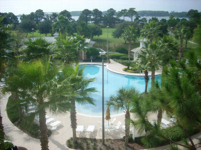
All that being said, this was the view from our balconey. Looking pretty good huh??? Next time you are staying at a hotel or resort pay attention the how they have decorated it. They have had a professional design the rooms and they usually pick decor that is timeless since they cannot redecorate often You may see a design that you want to copy at your home. I found mine!
I want to add shelves like this to the end of my cabinets to display my white teapots on. As I said it was a beautiful place!


1 comment:
Lovely--- especially when it feels like home away from home. Lucky you!
Post a Comment